Ditto Product Onboarding
Reducing TTA with a quick start onboarding experience
SQUIRRELS LLC
Designing simple onboarding to reduce time-to-activation in enterprise productivity software
B2B
Web
My Role
Outcomes

The Challenge
Ditto software allows users to share their screens and display digital signage on any connected monitor. We knew shortening the time it took users to reach an “Aha! moment” (perceiving product value) was the best way to reduce time-to-activation (TTA) and customer acquisition costs down the funnel. This framed much of our approach to modernizing Ditto.
One of the ingredients to Ditto’s secret sauce is that it relies on existing hardware. Being device- and OS-agnostic was appealing to IT teams deploying this solution in large, mixed environments.
However, it also presented a challenge: setup and use with third-party devices we can’t control. Setup, testing, and deployment very quickly became a slog for our users and customer support team. We focused on the setup and onboarding process for this major product update.
Project Goals:
Reduce product setup and time-to-activation for all users
Reduce customer acquisition costs
Inspire confidence, ease, and reduced frustration with complex installations and deployments
Key user questions we set out to solve:
What’s blocking or slowing me down from perceiving Ditto as valuable?
What barriers are currently present in the product setup process?
What would make my trial and onboarding experience better?
How confident am I this product will solve my problems?
Research & Insights
While we would have loved to analyze and make predictions using existing data, we had no onboarding experiences developed in any products. So this Ditto project served as a baseline for future research and development. This was also a collaborative effort between customer support, sales, business intelligence, and marketing teams. With no official researchers, we gathered data and analyzed where we could.
What We Conducted:
Competitor research
Customer support analysis
User and customer support team interviews
Surveys
What We Learned:
Setup-related tickets consume a lot of customer support’s time
Negative user sentiment is a leading indicator of attrition
IT admin’s avg. time to complete setup: 7 business days
End user’s avg. time to first use: 48 days
Design Process
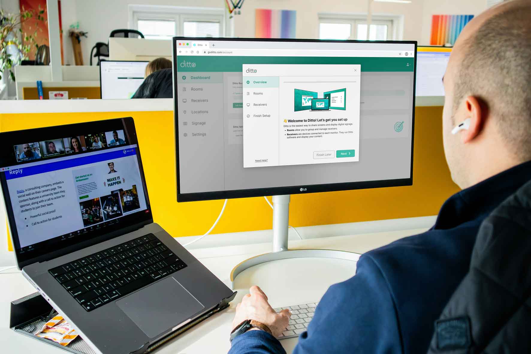
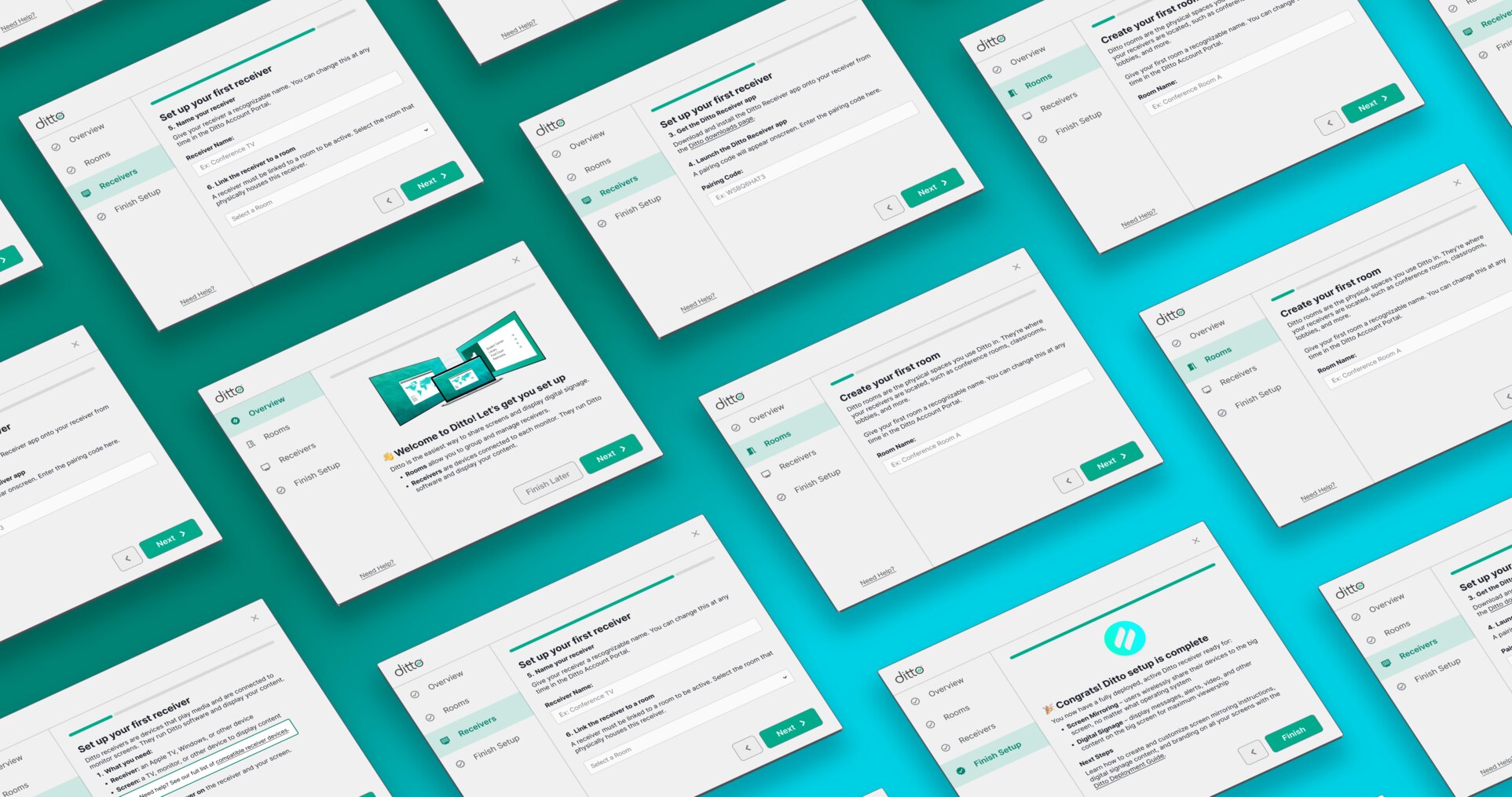
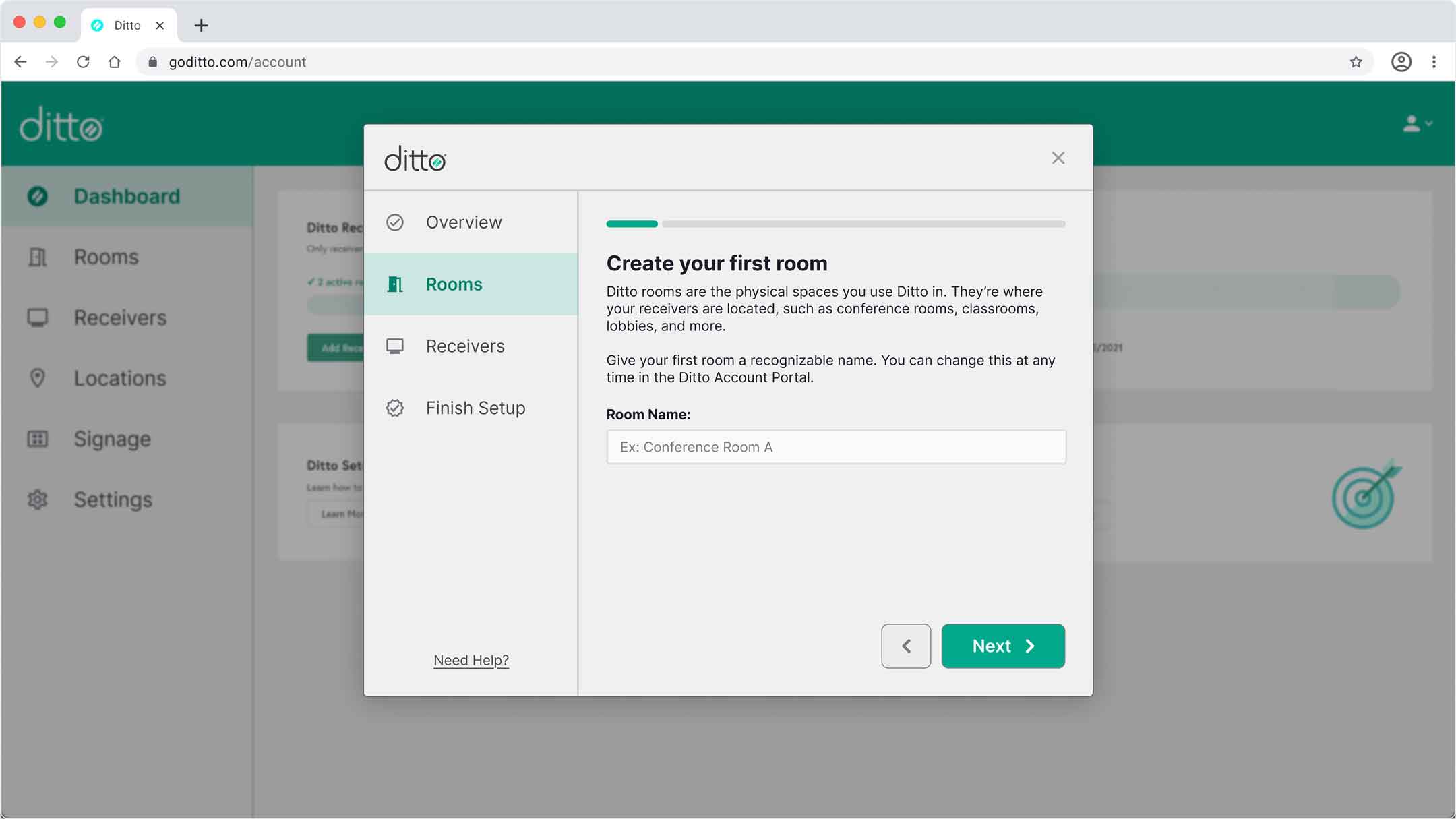
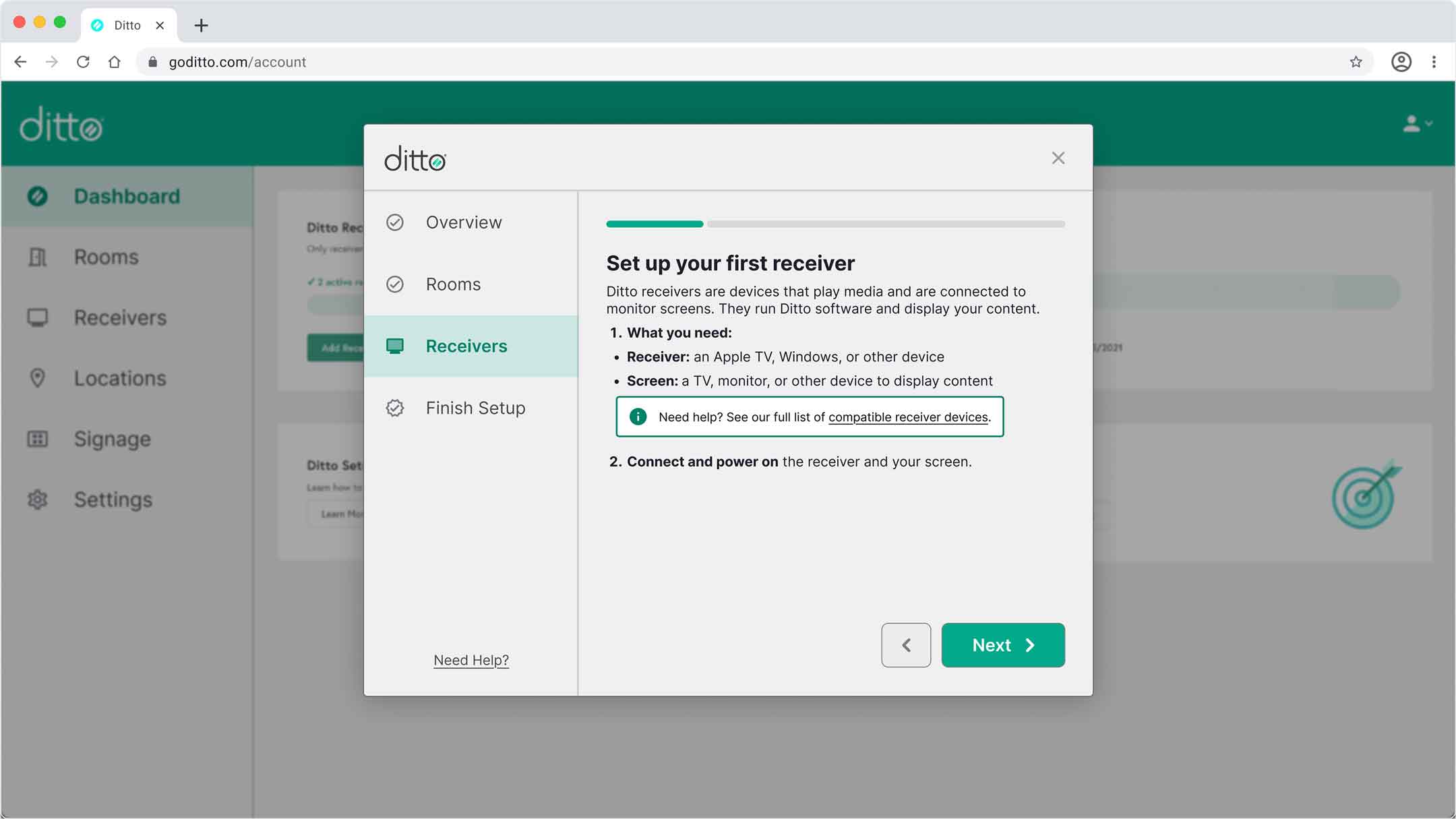
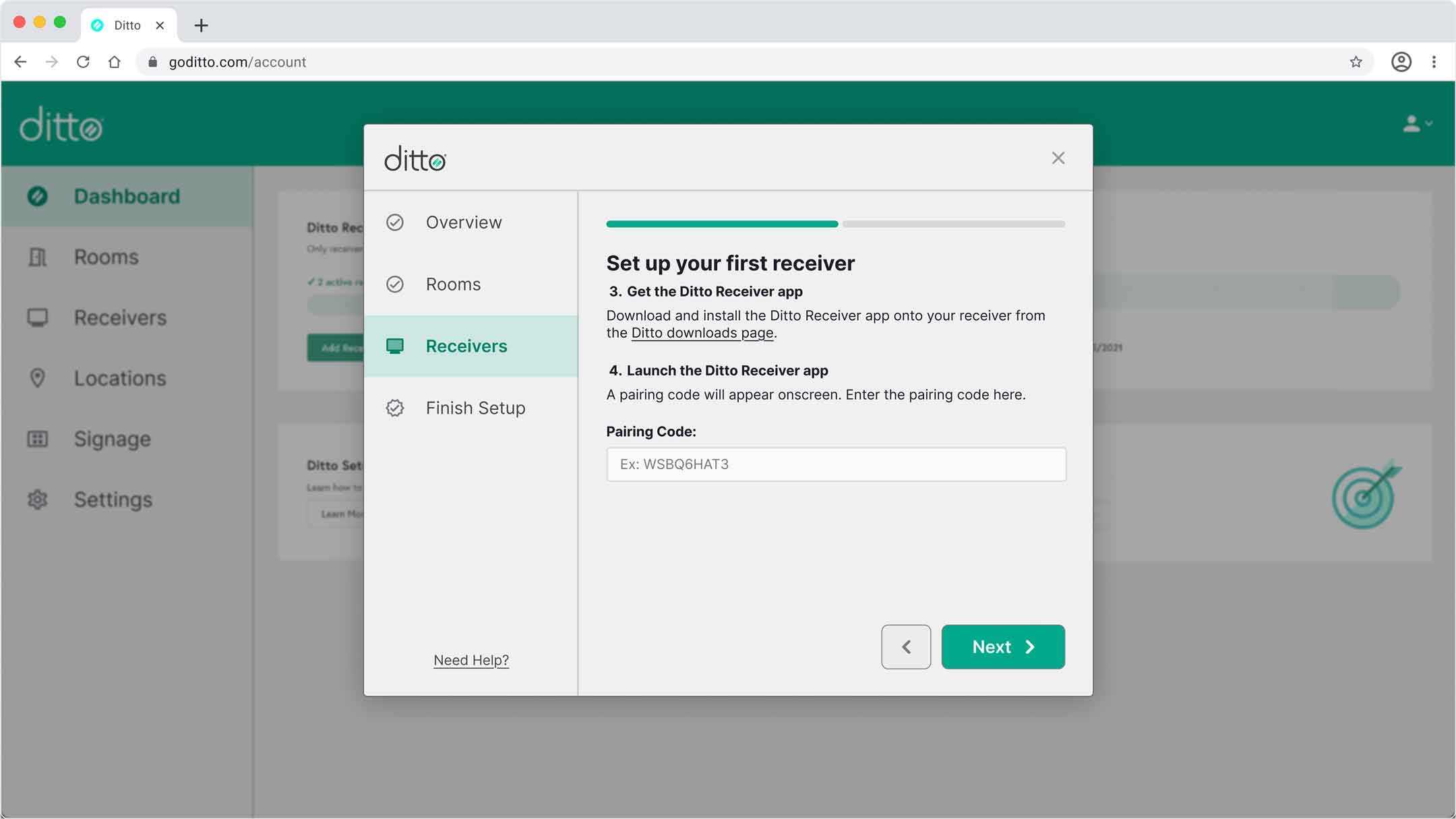
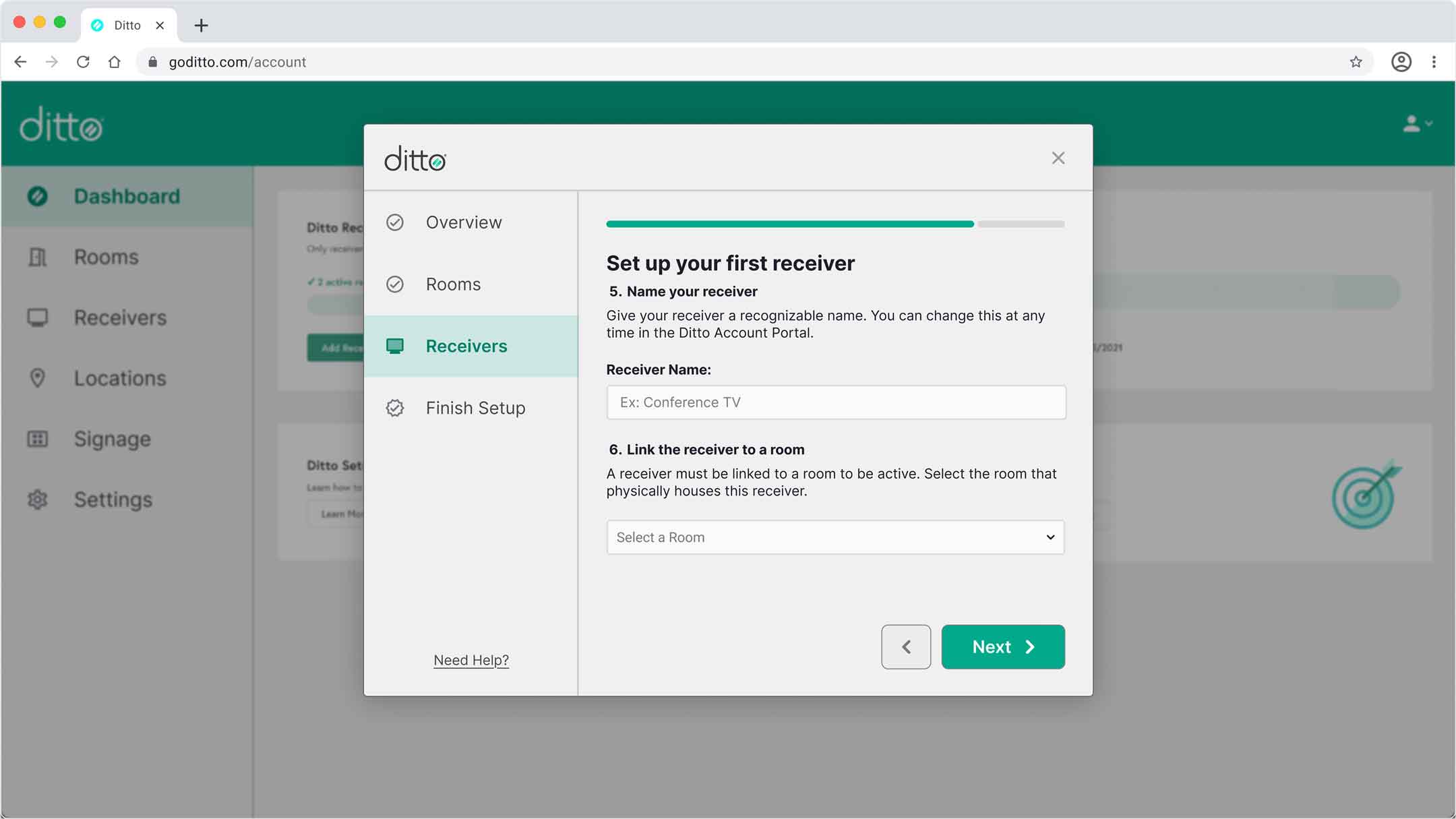
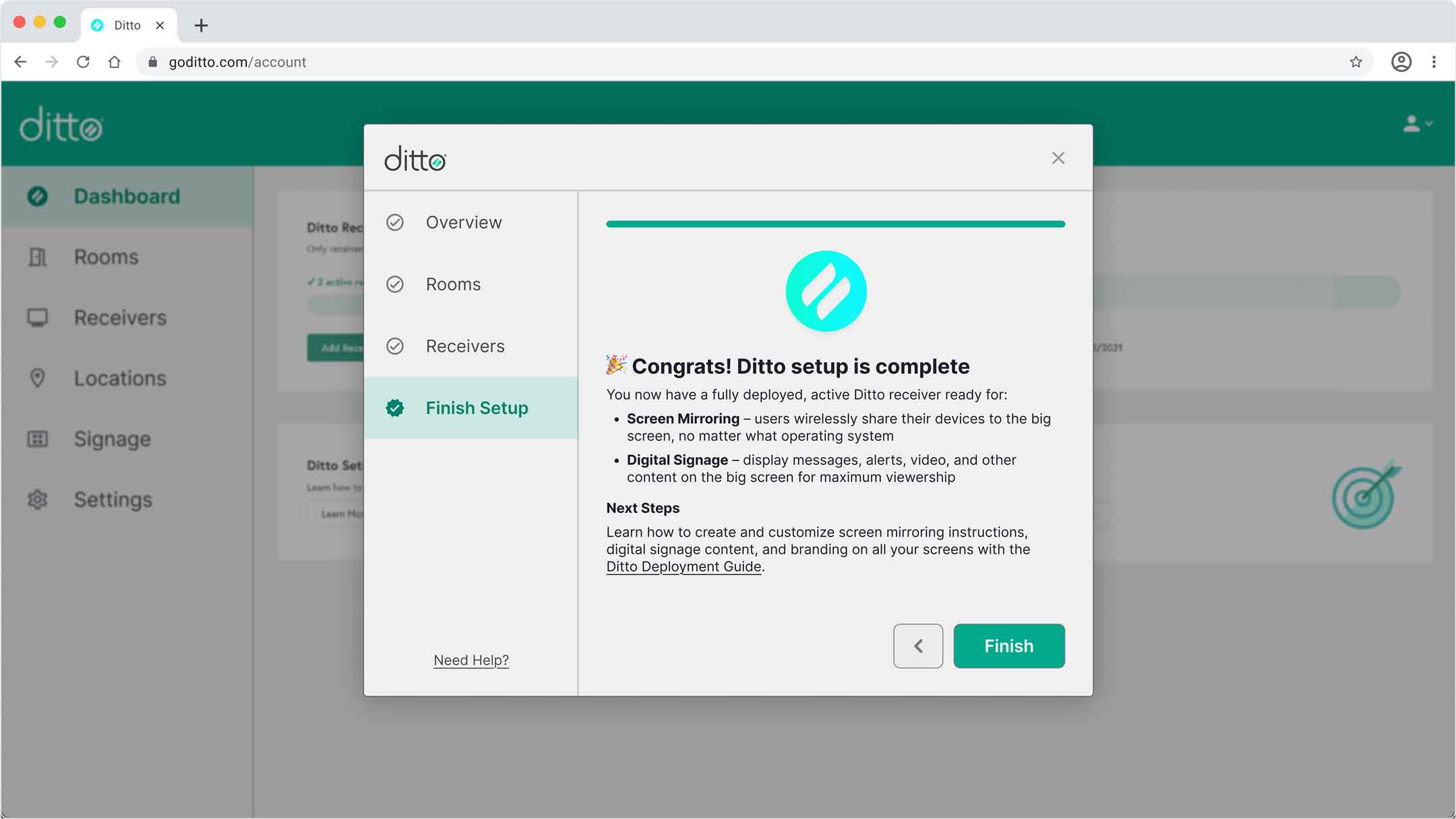
One way we set out to improve the setup process was an onboarding wizard walking users through full product implementation. We developed multiple iterations.
I created and pitched a streamlined quick start wizard focused on critical setup tasks, excluding low-priority steps and guiding users straight to necessary functions. This moved the user closer to an “Aha! moment” quicker than the full setup process would, adding value and more opportunity for activation.
My strategy: Get users feeling confident and successful with the least amount of time and effort possible up front. Then provide more complex and time-consuming tasks and information later. If we can guide users with a digital carrot, they'll be more likely to feel successful and retain their account.
Design Iteration:
Onboarding content: processes, positioning, context
Medium exploration: walkthroughs, product tours, pop ups, beacons, video demos
Context switching: keeping the user flow contained in a modal or touring the full UI
Quick start experience vs. complete product setup
What I Did:
Wireframing and sketches
User flow diagramming & design
Pitched and designed modal layout
Wrote all copy

Outcomes & Impact
18%
Decrease in TTA for admin users
2
Avg. # days saved completing setup
16
Tasks eliminated with quick start UX
My Work:
Reduced TTA, further reducing customer acquisition and retention costs
Saved users time and reduced complexity
Benefitted both customers and internal teams
Earned user confidence from their first interaction