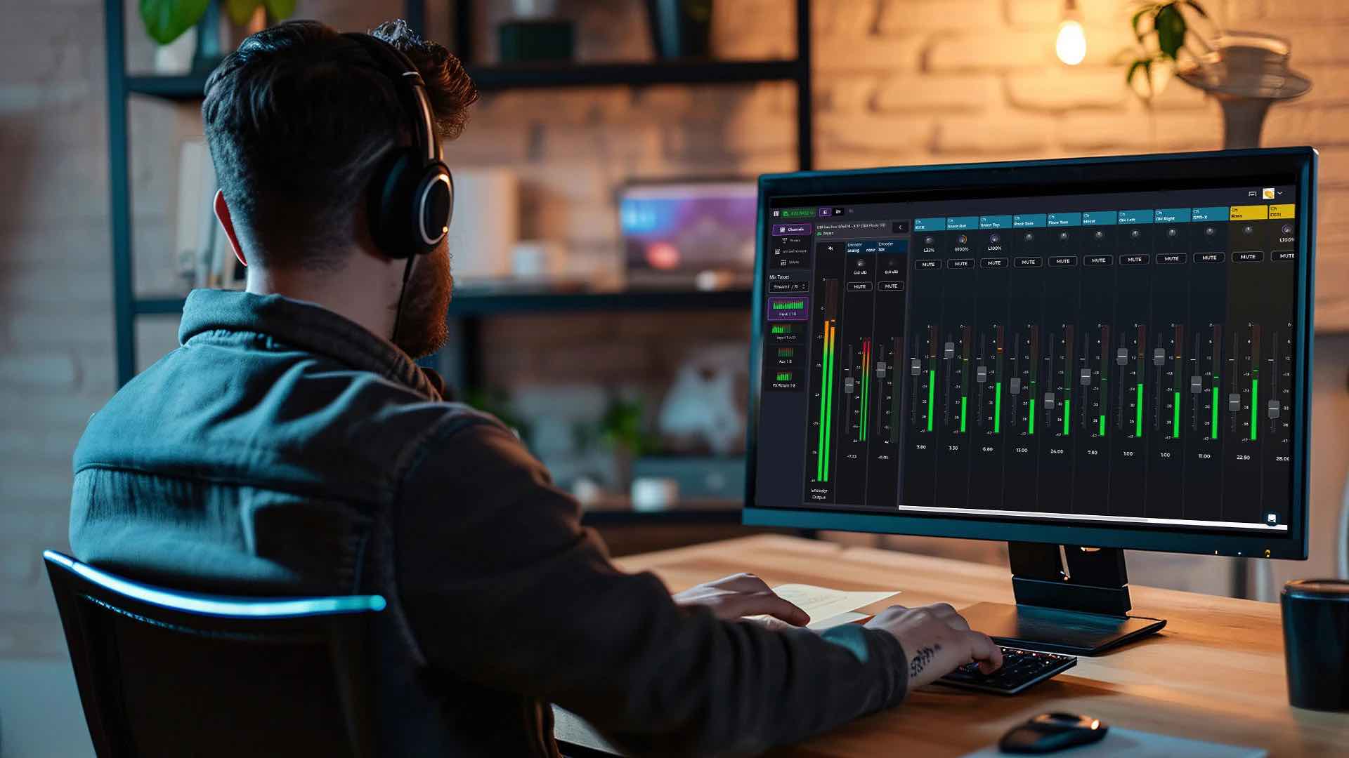


Spark Video Encoder
Launching flagship hardware with capacative touch UI
BOXCAST
End-to-end product development of HEVC video encoder hardware
B2B
Product Launch
Hardware
Native App
My Role
Outcomes
The Challenge
It had been 6 years since BoxCast released an encoder — we knew we could pack so much cool stuff into a new device. The product team identified an opportunity: an advanced video encoder we could develop and position in between beginner- and enterprise-level hardware currently on the market. We just needed to make sure people would use it.
Project Goals:
Launch into mid-tier price point with something better than competitors
Give users at-a-glance controls onscreen
Provide external storage & multiple connection types
Improve user satisfaction of task completion
Key user questions we set out to solve:
How does this device instill trust in my broadcast performance, quality, and stability?
Does this streamline my workflow or make my job easier?
What makes this better than other competing encoders available?
Research & Insights
My favorite methodology for this project was interviewing users. Hearing them describe their pain points and areas of delight made our research data all the more real, particularly when they indicated problems blocking them from performing actions or navigating the UI.
What We Conducted:
Product discovery & business analysis
Competitor research
User interviews
Surveys
Usability and prototype tests
What We Learned:
Most competing hardware at our proposed price point was extremely basic — no screens
Users were excited for the possibility of a mid-tier price point
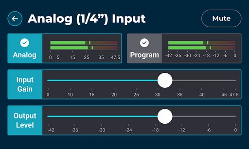
Onscreen controls are desired for quick, high-level operations
Resistive touchscreens in existing products were not pleasant to use
Context & copy are incredibly important for user education & adoption
Feedback loops: action feedback is vital when navigation is limited
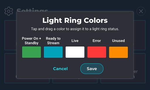
Users really wanted a Save button for editing settings
Design Process
I focused on two common threads from our research: navigation and feedback loops. Users didn’t understand the UI layout enough to perform tasks efficiently. They also noted a lack of feedback in the UI, often unsure if they were actually finished after completing a task.
Screen real estate on the encoder was small, so it was vital to keep any additional information I’d add contextual and logically nested.
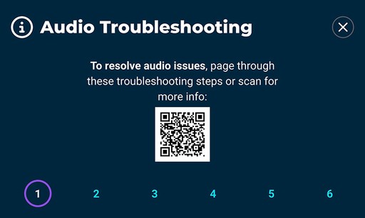
Many users couldn’t identify how to proceed once an error message appeared. I specifically added copy and design changes to better reflect where to tap and navigate both on and off the device for more information.
Design Iteration:
Pagination vs. sliders vs. scrolling for longer content sections
Tested toggles, labels, save, OK, & exit buttons
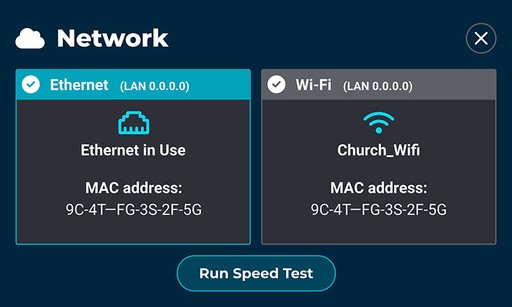
Connection ports labels & positioning
Warning & error message standardization
External light ring controls & customization options
Users really wanted a Save button…so we gave them a Save button
What I Did:
Implemented confirmation and feedback loop paradigms
Designed screen orientation experience
Created troubleshooting & support modals
Developed error design language: colors, typography, layout
Wrote all copy: tooltips, menus, labels, etc.
UI design support
Design QA
Outcomes & Impact
13%
Increase in user sentiment from feedback loops
350+
Units sold in first year
.52%
Increase in streaming time since launch (4000+ hours)
My Work:
Improved user satisfaction, sentiment, & task completion rates
Reduced cognitive load with contextualized information
Empowered users to customize their device to their own workflow
Validated discovery research and market positioning